woot woot for day five! another long day at work but i was super excited to come home and work on these cards.
i picked the colors this morning [with the help of siri of course] and thought in my head all day how i might bring this card together. it seemed to be a little bit of an odd color combination and i was thinking that i might have to resort to some kind of floral theme in order to make it make sense. have i mentioned how much i'm enjoying pushing the boundaries of my creativity? i'm not sure i would ever pick these colors to use together without the use of my swatch book.

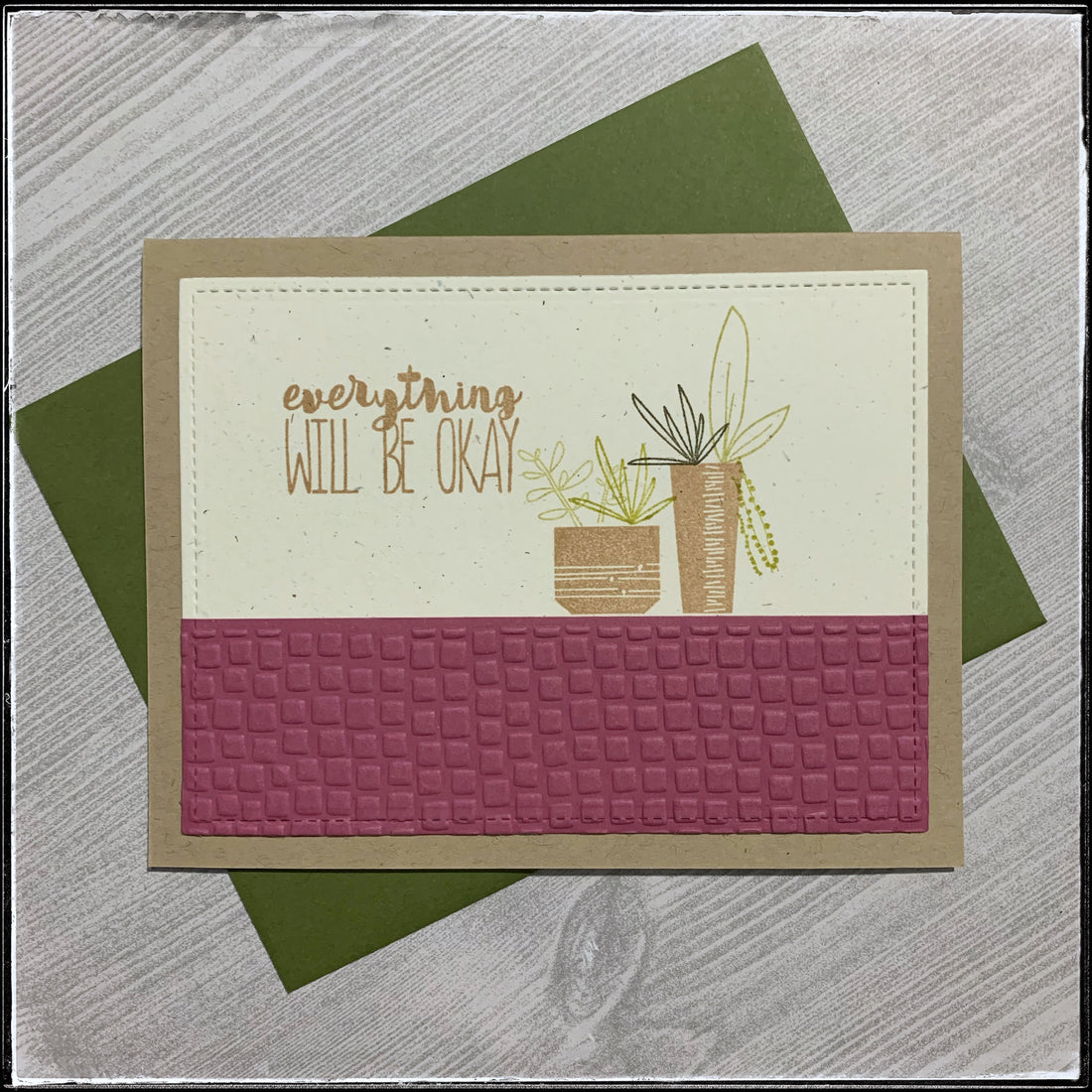
i used a sketch on this one as a base concept, but it took off from there and ended up completely different. this is one reason that i love sketches as starting points so much! i flipped it horizontally and used it in a landscape position. i didn't overlap the shape with the now bottom portion, but i did add some dimension.

i did in fact resort to using some floral stamps - succulents to be exact, as they're one of my favorite things - stamp wise and in real life! [i have a baby collection that's grown over the years and i'm finally learning how to properly propagate them, it's so exciting!] the green colors aren't overly used, but i still think they work for the combination. plus, i used a green envelope to add coordinate.

i stamped both the pots and the sentiment in the classic kraft to match the card base and i stamped the sentiment twice so the ink was a little darker for emphasis. i think this sentiment is fitting in quite well with my recent desire to have uplifting and motivational sayings.
the greens combine as the various types of leaves on the plants. to add a little dimension to an otherwise flat, one-layer card i dry embossed a repetitive square pattern on the autumn rose cardstock. this is such an interesting color. depending upon what it's used with, sometimes it feels more red and others more purple. colors just make me so happy with their incredible properties.

additional detail can be found around the perimeter of the inner cream square - as i die-cut it with a faux stitched pattern. [i know the cream color wasn't technically a color on the swatch, but i really think that most neutrals [black, kraft, cream and white] can be used in conjunction with any of these swatches. plus i make the rules, so, yeah.]
i'll be adding this card to the shop as well with all the others - i'm creating quite the collection! i haven't done much creating for the shop or the business this year - i find that january and february always leave me in kind of an unwind time. i lost my mojo a bit and the ability to force myself to sit and create/post content for both march meet the maker and the 100 day project has been so good for my soul. i have so many new ideas i've been jotting down and i am looking forward to making the time to make them come to life.

seeing crisp ink and incredible texture like this just make me want to make all the things! side note - i am trying a new craft and i just received the kit and can't wait to get started and share details. i just want to make all the things!
what's your favorite thing to make? have a craft you think i should try? let me know! send me a message or a link below.